The basement construction is almost done.
Here are some updated pictures.
Tuesday, May 31, 2011
Wednesday, April 6, 2011
Erika Ward
ERIKA WARD

As a young girl, I was a complete bookworm and loved to write. My all time dream was to become a journalist, but it wasn't until my teen years that I fell in love with interior design. At home, surrounded by decorators and an accomplished architect, is where I learned that God made us all creators. I was also taught how to help others enjoy the work of their hands and soon, myself, formed the heart of a teacher
A formal degree in design managed to elude me in college where I received a degree in Finance from The University of Georgia. That degree afforded me the opportunity to work for well known design/build firms and to manage multi-million dollar construction budgets. Being in the environment of design and construction made my heart yearn even more for a full time career in design. I took the next step and enrolled and completed coursework in Interior Design at American InterContinental University. In 2005, I established Erika Ward Interiors and never looked back.
I'm so blessed to do work that I love, to have your support, and most importantly the support of my husband Chris. Together, we are teaching our three children to pursue their dreams and to receive the best life has to offer.
Check out her blog.
http://www.blulabelbungalow.com/
Light and Color Warm a Casually Elegant Family Home
The home you're about to see belonged to a viewer who called on Meredith Heron for assistance in repairing an existing renovation job. Heron and her staff turned an inefficient floor plan into a dream home for a Toronto family of 5. As it happens, a week after the 18-month renovation was completed, the family received a work assignment that would relocate them to New York City. But the memories of this home are encapsulated in these beautiful images and insights from the designer.
For a style and function, Heron had cabinet makers integrate a bulletin board wrapped in Winsdor Smith's Pelegos fabric. The workstation has both open and closed storage for light home office use. Opposite the workstation you can grab a hot or cold drink from the beverage center
The foyer used to be a dark room with only 8-foot ceilings. Above it was a former nursery that was no longer in use. To create an entry that better fit the scale of the house, we opened up the room to create a two-story foyer. The thick moldings along the perimeter hides unsightly support beams.
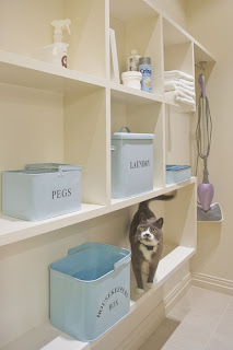
Actually it is a laundry room and mudroom combined. With a large family, there is always an insurmountable need for storage. Each family member has a locker, as seen on the left side of the room. A wooden lip extends from the cabinet to provide a place to sit while removing clothing and shoes.
A 5-year-old sleeps in this room, but as you can see the decor grows with her. An assortment of soft pink, modern floral prints, and classic furnishings gives this space a timeless appeal.
The homeowner's existing dining room table was sent to a cabinetmaker where two leaves were created to accommodate more seating and was stained along with the buffet to adapt to the home new color scheme. New chairs surround the refurbished table. A pendant fixture from Union Lighting polishes the look.

reference: houzz.com
Cheers!
Kelly
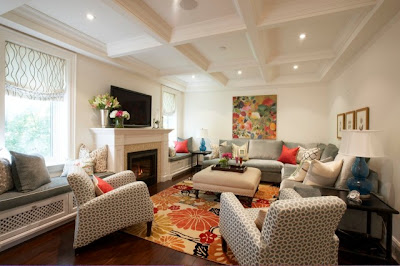
The painting, from the homeowner's personal collection, was the color guide for the entire house. The palette consists of pale gray, blue, pink, green and orange. Each time she looked at the painting it made her happy. The furniture was upholstered in Kravet's Smart line of high-wear fabric. The dual window seats, upholstered in the same fabric as the sofa, offer more opportunities for lounging with a good book.
The pre-existing family room, powder room and staircase are now the kitchen. This was a major change in the floor plan because it now unifies the entire house. The 9-foot island is made of honed black marble and is where the kids generally eat their meals.
The trough sink makes for easy clean-up after family meals — and when filled with ice, it doubles as an oyster bar.
For a style and function, Heron had cabinet makers integrate a bulletin board wrapped in Winsdor Smith's Pelegos fabric. The workstation has both open and closed storage for light home office use. Opposite the workstation you can grab a hot or cold drink from the beverage center
The floor consists of three different tiles: oriental gray 1x1 mosaic tiles make up the majority of the floor, carrera and black absoluto marble trim make up the border. I'm was extremely pleased with the end result
Actually it is a laundry room and mudroom combined. With a large family, there is always an insurmountable need for storage. Each family member has a locker, as seen on the left side of the room. A wooden lip extends from the cabinet to provide a place to sit while removing clothing and shoes.
Items found in this room range from splurges to budget-friendly finds. The head board was constructed from folding shutter doors and topped with pillows from Ikea and HomeSense. The screen divider even received a faux paint treatment. The splurge in this space was none other than the Madeline Weinrib rug.
Calcutta marble is the predominate material in the master bath, followed by the custom cabinetry. The panels beside the mirrors have a touch door that hides the medicine cabinet.
Mirrored frame artwork turns on the glam above this soaker tub for two.
In the former master bedroom, now guest room, Farrow and Ball's Chinese Blue paint and a coral tufted headboard come together to make a cheerful, peaceful retreat. The footstools were an eBay purchase ($125 for the pair).
"Choosing pinks can be a bit tricky," says Heron. "I tend to move towards taupe with a hint of pink like Benjamin Moore's Melted Ice Cream [as seen in the previous image]. As a rule of thumb, I always go two shades lighter on a paint deck. Pink usually reads 20 percent brighter once on the wall.
Heron adds hostess stools to almost every job. "When entertaining, the host rarely sits, but when they do they can pull up one of these little stools for a quick chat."

Benjamin Moore's Gray Moire provides the backdrop for both the formal living room and dining room. Custom pieces include the creamy gray chenille sofa and two accent chairs. The side table was damaged in shipping, but Heron made a deal with manufacturers got it repaired and painted the same hue as the walls. Always a stunner, the sunburst mirror is from Ren-Wil.
reference: houzz.com
Cheers!
Kelly
Monday, April 4, 2011
Weekend finds!
I am constantly looking at pictures of houses. Here are a few that I have downloaded this weekend onto my iPhone. (I love my phone)
look at that Island!
How about that great use of yellow in this living room.
Did you happen to notice the number of urns in this room.....
I also like the curved edges of the area rug. It is not completely round
or square. I love not having corners.
Another room with yellow. I think I was feeling spring like on the weekend.
I saw pictures of this laundry room and thought... how cool!
The dryer is mounted to the wall. It took me a minutes to find it.
I don't think I have ever seen that before.
Another awesome kitchen. Look at the height of the ceiling...I would definitely need a step ladder to get to the top of those cabinets. I also really like the lights over the island.
Big Islands are in. A good cutting board is essential in a kitchen and this built in one in the island
is wonderful.
A modern bathroom. I like the stone work. Not a big fan of modern, but some of it is growing on me.
Cottage feel in the dinning room.
Home office with a great light and storage space.
Have a spectacular day!
Cheers
Kelly
Subscribe to:
Comments (Atom)


