I was reviewing BC Home magazine online and came across this article that talked about PNE (Pacific National Exhibition) Prize Home 2010. So I decided to investigate and see what the 2009 house looked like and the 2010 house looked like.
Here are some stunning pictures I have found starting with the 2009 house.
I love craftsman style homes!
Stunning front entry. I wonder what is behind the door? A playroom or a closet?
Lovely open hallway.
Looking down from the stairs to the front entry. I would like to know who cleans the windows? LOL
Kitchen island and a view into eating area.
The other side of the kitchen.
What a nice window to look out when doing dishes.
I love the window seat in the dining area. Makes it feel so much more relaxed.
Did I forget to mention the double sided fireplace... nice!
A view from sitting on the window seat.
Looking from dinning room into kitchen.
Living room with doors onto deck.
I can see the front door from here. These windows would be facing the
Master Bedroom with large french doors going onto second story deck.
Master bathroom
Another view of master bathroom
2nd bedroom. I like the organization in the closet, but where are the doors?
Home office. I think I could work from home.
Powder room
Main bathroom for bedrooms upstairs.
The media room with a purple wall.
Love the built-ins.
The at home gym.
Very nice. Is there beer in the cooler?
First floor deck leading to second floor deck - off master bedroom
Now for the 2010 Pacific National Exhibition Prize Home
Exterior of 2010 prize home
I found the house plans. I couldn't find 2009 plans.
Front entry.
Kitchen with some pretty funky stools.
Dark and light cabinets. I like this combination.
I like the combo of counter top and cabinets together.
The eating area. I love love love those chairs.
looking at the family room to the left and the living room to the right.
The family room.
Notice the blue is carried thru out this entire area.
Another view of family room
The living room with it's open concept feel
I wonder what is in that arch way?
Another view of the living room
Looking down at the living room.
Main bathroom.
Nice use of tile in the shower.
Media room. Off of the kitchen.
I black windows add some drama to the whole house.
Another view of media room.
And another.
Master bedroom. There are sliding doors to pull across to get your privacy.
A view from the other side of the room.
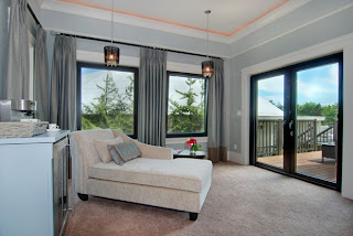
Other end of master bedroom, with a reading area and doors off to deck.
Master bath with fireplace.
Nice soaker tub.
Great place for the TV and I like the crystal chandeliers for bathroom lights over each sink.
There is also another matching light over tub. Neat idea to add a sitting area in front of fireplace.
2nd bedroom.
3rd bedroom.
I hope you enjoyed my house tours.
Kelly


No comments:
Post a Comment